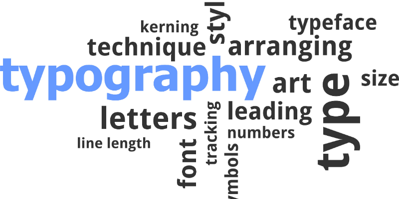
Typography is an art of writing words. How do you write, which font you choose and what style is making your writing/typing attractive. There are a total of 300,000 fonts in the world as a Ballpark figure. Some of the fonts/styles are not even included in the statistics. There is a total number of 60,000 font families in MS Word.
From these thousands of fonts, we can imagine how important role typography plays. It is also a form of art just like the other art forms like calligraphy, painting, photography, etc. All these art forms deal with creating an impact on the viewer.
Typography Basic Rules to Follow
Typography is the basic component for making your text catchy and this component is even more important for graphic designers. For a viewer or a reader, it is important how he/she grasps the writer’s point of writing. When a writer writes or designer designs, the basic purpose of his design or writing must be clearly conveyed through the text, and in this procedure, typography using smart fonts plays a crucial role.
Typography works as a tool to create and shape content. Playing with fonts and spaces can make your text more or less impactful.
Starting from the basics
Making the right composition using accurate vocabulary, specific spaces, and measurements do the right starting job. Make the text look attractive yet simple.
Font communication
Keep in mind your target audience while using fonts and doing designing. It helps to connect to people.
KERNING – an important tool
Adjusting the spaces between letters/characters to make to look aesthetically appealing. This makes the text stylish as well as readable.
Limited fonts
Do not overuse fonts. Different font for different lines makes it look messy. 2 to 3 of them are enough to use.
Keeping in mind the Alignments
Making the paragraphs justified or center-aligned sometimes makes it difficult to read. Avoid using it.
Create a visual hierarchy
In your texts, you may emphasize certain portions to be highlighted and others to be less highlighted comparatively.
Correct match of two fonts
Two different font styles make a great impression if they go hand in hand.
Making grids
Working with grids makes the design or text look harmonical and synchronized.
The text should be readable
Make sure the text you design is readable. Making the text too complex and over-designed makes the reader confused.
Choose the colors wisely
Selecting a font for designers is even more crucial while selecting colors. A right combination of colors making the text easily readable will do the right job.
Principles of Typography
We can say if the content is king, then typography is the crown for the king. To make your content enhanced and to make the reader get more information on the first look, creative typography is the key.
Typography principles are similar to the typography rules. These are some of the elements which a person particularly the designer, should opt for an effective outcome.
Choosing fonts smartly
In selecting fonts, there come two elements, one is choosing a typeface and the other one is choosing a specific font. A typeface is a whole family of particular designed fonts, while a font is a single design of particular size and shape. Popular typefaces include Serif, Sans serif and Monospace.
Size of the font
Size and measurement of font or text depend upon the requirement for what purpose it is used. Characters you want to emphasize on should be in large size and so on.
Spacing
Spacing between characters and line management is a very important to make sentence easily readable.
Focus on Alignment
Correct alignment makes the reader read the text more attentively. People mostly start reading from the left side, so it is important to align your text from the right side and it is preferable to be consistent throughout.
Use correct grammar
Using the right grammar is the key to good writing. Typography comes later, first your grammar and vocabulary should be proper.
About Scott Spencer
