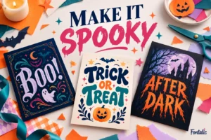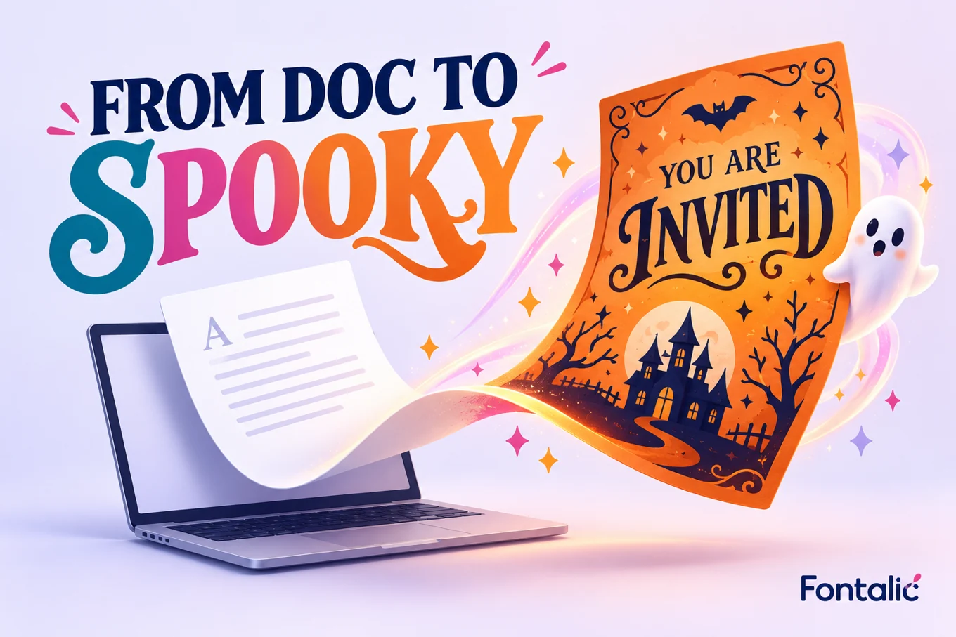
You can make a Halloween invitation or sign in Microsoft Word by combining one dramatic heading font with a simple font for the details. The practical question is whether the font is installed and available in your version of Word. A font shown in someone else’s document is not necessarily included on your computer.
This guide covers four downloadable choices, the desktop installation route, and a simple layout you can adapt. These fonts are recommendations to install, not a list of fonts guaranteed to come with Word.
Four Halloween fonts to try in Word
Download from the official Google Fonts family pages linked below. The corresponding license files are listed in Sources. Keep a copy of the license with the font download so you can distinguish the actual font terms from a download site’s general description.
| Font | Project direction | Layout advice |
|---|---|---|
| Creepster | Playful party invitation | Use a short heading |
| Nosifer | Dripping horror sign | Leave space for the drips |
| Butcherman | Rough haunted-house title | Keep letters large |
| Metal Mania | Dark event poster | Pair with quiet body text |
Pumpkin Party
A playful heading; practical details stay plain
Creepster is a useful first comparison for a family party. Nosifer makes the horror effect more prominent, so start with fewer words. Butcherman and Metal Mania offer different dramatic directions. Try your real event name in all four before settling on a look. A font that suits “Boo” may be less effective for a long organization name.
How to add a Halloween font to Word
On Windows desktop
Microsoft’s documented route is to download the font, extract the ZIP if necessary, and install the TTF or OTF file in Windows. Right-click the font file and choose Install. Reopen Word, then select your heading and choose the new family from the font list. Only approve installation prompts when you trust the source.
On a Mac
Install the downloaded font through Font Book, then reopen Word and look for its family name. Microsoft’s custom-font guide includes Mac guidance. If the font still does not appear, check that installation completed and that the file is a supported font rather than the ZIP archive.
Word for the web and shared documents
Do not assume that installing a font locally adds it to the browser version’s font menu. Check the fonts actually available in the version you will use. If custom typography is essential, finish and inspect the document in a desktop app that supports the installed font.
When someone else opens an editable document, their available fonts may differ. For a final invitation that does not need editing, export a PDF and inspect it on another device. This is a proofing step, not a guarantee that every export preserves every font feature.
After Dark
Give decorative letters generous vertical space
Build a Halloween invitation that is easy to read
- Choose the finished size. Decide whether you are making a full-page flyer, a small card or a digital invitation.
- Write the details first. Add the date, time, place, host and RSVP information in a plain font.
- Add one decorative headline. Apply your Halloween font to the event name, not the whole document.
- Set a clear hierarchy. Make the heading largest, the main details easy to scan, and secondary notes smaller but readable.
- Print or export a proof. Judge the actual output before making multiple copies.
Word layout example
Pumpkin Party
[Day, date] • [Start–end time]
[Venue and address]
RSVP: [Contact] by [Date]
For a US Letter flyer, begin with a spacious layout and a short title. Adjust the font size to the actual viewing distance rather than following one universal point-size rule. A tabletop invitation and a porch sign have different jobs. Read a printed sign from where a visitor will stand.
If your heading takes several lines, shorten the words before reducing the size. Put supporting information in a separate paragraph so changes to the display font do not disturb the whole layout. Avoid forcing alignment with repeated spaces, which can shift when the font changes.
Fix common Halloween font problems in Word
The font is missing from the menu
Check that you installed the actual font file, not just downloaded an archive. Look for the family name rather than the filename. Close and reopen Word after installation. If you are on a managed work or school computer, installation may be restricted; use an available font or ask the administrator through the normal process.
Dripping letters are cut off
Increase the space around the heading and inspect paragraph line spacing and text-box boundaries. A tightly fixed line height can leave too little room for decorative details. Print one proof because the editing view and the final output can expose different problems.
The document looks different on another computer
The other device may substitute a font. Confirm the recipient’s setup if the file must stay editable. If it is a final handout, compare the exported PDF against your original. Check the heading, numbers, punctuation and line breaks, not just the first word.
Some characters are missing
Try the exact names, accents and punctuation you need before building the whole design. Decorative families may not cover every character. A plain companion font can handle the details while the display font is limited to a supported headline.
Use copy-and-paste text for the right job
The Fontalic Halloween generator creates Unicode text, not installable font files. It is useful for a short social caption or display-name accent. For a printable Word design, a real font generally gives you more predictable control over spacing and layout.
Need wording? Choose from our Halloween sayings for cards and invitations. Keep logistical details in ordinary text even when the headline is decorative.
Frequently asked questions
Does Word include a Halloween font?
There is no single Halloween font guaranteed across all Word installations. Check your font menu or install an appropriate licensed family in the desktop environment.
Do I install fonts inside Word?
On Windows, install the font in the operating system, then reopen Word. Microsoft’s instructions cover the supported file types and installation steps.
Can I use these fonts for a business flyer?
The four linked families have SIL Open Font License files. Review the license supplied with the exact download and check the rights for any other artwork in the flyer.
Why not use a decorative font for every line?
Display fonts can make small text difficult to read. Keep the headline expressive and the practical details simple.
Sources