Instagram now has three named type directions in its refreshed brand system: an updated Instagram Sans, a handwriting face called Instagram Pen, and a new Instagram Mono. The important distinction is simple: these are official brand typefaces, not three “fancy text” buttons that automatically appear in every bio, caption, or Reel editor.
Last reviewed: August 31, 2026
What are Instagram’s new fonts?
On August 13, 2026, Meta introduced a refreshed Instagram brand identity. The announcement names an updated Instagram Sans, a new handwriting typeface called Instagram Pen, and a new Instagram Mono face. It also says the refreshed identity is rolling out globally, with the wider system continuing through 2026 and beyond.
That tells us what belongs to the brand system. It does not promise that every account will receive three new choices in every text field at the same time.
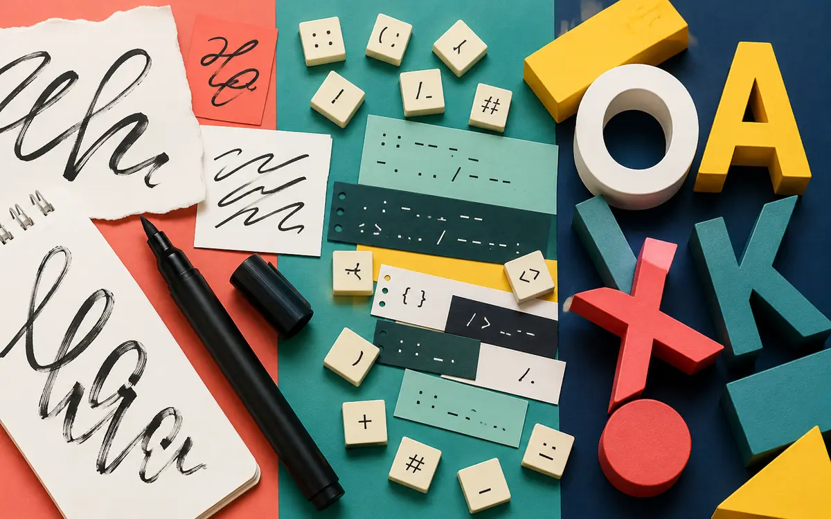
Instagram Sans, Pen, and Mono compared
| Typeface | Visual role | Best mental model |
|---|---|---|
| Instagram Sans | Clean, flexible, and built for broad brand communication | The dependable voice for interfaces, labels, and clear messaging |
| Instagram Pen | Handwritten and expressive | A personal accent that suggests an individual voice |
| Instagram Mono | Even, technical rhythm | A structured counterpoint for codes, labels, and editorial contrast |
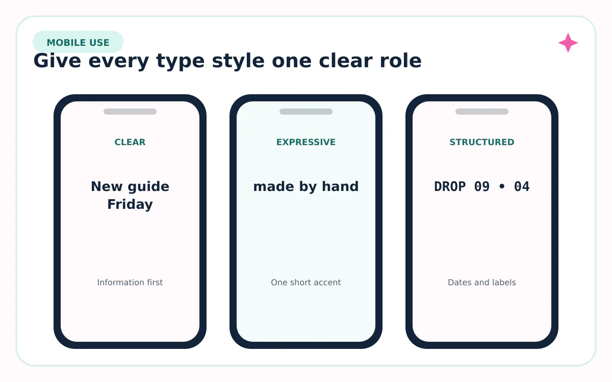
Instagram Sans is the system workhorse. Pen adds the warmth of handwriting. Mono creates a deliberate, fixed-width feeling. The three are more useful as a hierarchy than as competing choices: one carries information, one adds personality, and one creates contrast.
Meta describes the new identity as giving community work more room to carry the energy. In practice, that argues for restraint. A creator’s photo or video should remain the focus; typography should organize it.
Where will the new Instagram fonts appear?
The first visible changes may not arrive in one place. A brand refresh can touch the wordmark, marketing, motion, layout, product surfaces, and creator tools on different schedules. Meta specifically says the refreshed wordmark is rolling out globally while the full identity follows through 2026 and beyond.
If you see Pen or Mono in one account but not another, check the app version, account type, region, and exact feature. Do not uninstall a working app or download an unofficial font file just to chase a screenshot.
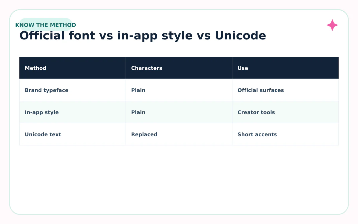
Instagram’s official fonts are not the same as copy-and-paste fonts
A real typeface changes how ordinary characters are drawn. Copy-and-paste “fonts” usually replace ordinary letters with visually similar Unicode symbols. The first method preserves the underlying word; the second changes the characters themselves.
That difference affects search, screen readers, line breaks, and compatibility. A Fontalic result can be useful for a short decorative display-name or bio accent, but it does not install Instagram Sans, Pen, or Mono and is not an official Meta asset.
| Method | Underlying text | Good for | Watch for |
|---|---|---|---|
| Official brand typeface | Ordinary letters styled by Instagram | Brand and product surfaces where Instagram provides it | Availability and licensing |
| In-app text style | Ordinary text styled inside a creation tool | Stories, Reels, or other supported editors | Feature and account rollout |
| Unicode copy-and-paste text | Different Unicode characters | Short profile accents | Search, accessibility, and rendering |
How to get a similar look without confusing the three methods
- For an Instagram creation tool: use the font choices the official app shows for that surface.
- For a Canva, video, or website design: choose a licensed sans, handwriting, or mono family with a similar role—not a copied brand font from an unknown site.
- For a bio or display name: keep the searchable words plain and use one short Unicode accent only if it survives a paste test.
- For a business identity: build your own hierarchy instead of imitating Instagram’s wordmark.
A strong substitute system might pair a neutral sans for information, a handwriting face for one short phrase, and a mono face for dates or labels. The relationship matters more than matching a proprietary shape.
Before publishing, test the result on a phone, switch light and dark mode, and ask whether a new visitor can understand the message without decoding the typography.
Sources reviewed
Platform features and character rules can change. We checked the first-party and standards sources below on August 31, 2026.
Frequently asked questions
Can I download Instagram Pen or Instagram Mono?
Meta’s brand announcement names the typefaces but does not grant a general public license there. Use official Meta resources and published license terms; avoid files from unverified download sites.
Are Pen, Mono, and Sans available in every Instagram account?
Not necessarily. Meta says the refreshed identity is rolling out globally through 2026 and beyond, so surfaces and accounts may update at different times.
Is Instagram Sans the same as a Unicode font generator?
No. Instagram Sans is a typeface. A Unicode generator substitutes characters so the result can be copied between apps.
Will copy-and-paste text hurt my account?
A short accent is unlikely to define account performance, but decorative Unicode can reduce readability, search matching, and accessibility. Keep essential wording in ordinary text.
Which of the three is best for Reels?
Use the option the Reel editor actually provides and match it to the job: a clear face for information, an expressive face for one short hook, and mono styling for a structured label.