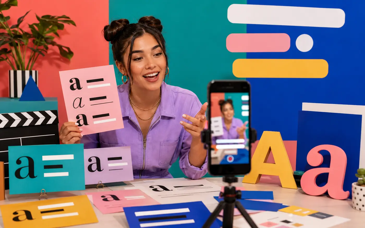
A Reel font pairing has less than a second to establish hierarchy. The hook should stop the eye; the supporting face should make the next line effortless to read. These 12 pairs are built around that division of labor, with mobile contrast and interface safe zones in mind—not around using two decorative fonts at once.
Last reviewed: August 31, 2026
The fastest way to choose a Reel font pairing
Choose the supporting font first. It must survive small size, motion, compression, and a quick glance. Then choose a display face that creates contrast without changing the tone of the video.
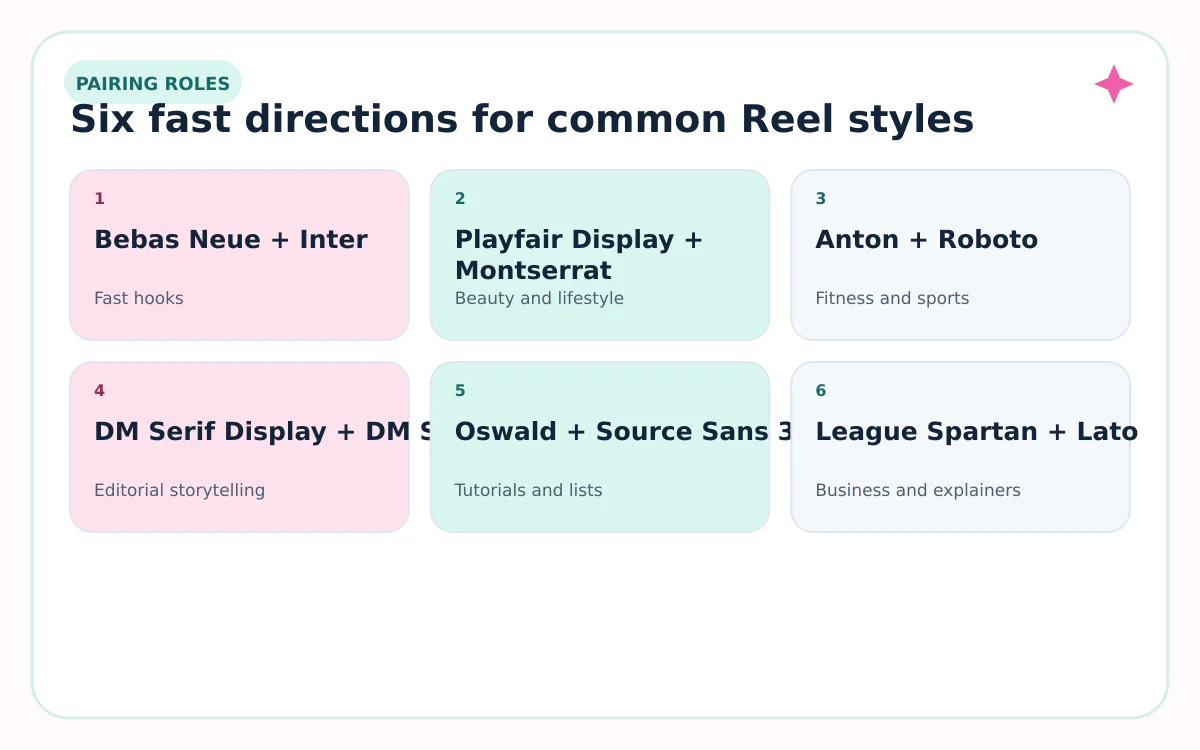
For tutorials, start with Oswald + Source Sans 3. For lifestyle or beauty, try Playfair Display + Montserrat. For fast sports clips, use Anton + Roboto. For a clean tech look, use Space Grotesk + Manrope.
12 font pairings for Instagram Reels
| Pairing | Best for | How to use it |
|---|---|---|
| Bebas Neue + Inter | Fast hooks | Use Bebas Neue for a 2–5 word opener and Inter for context. |
| Playfair Display + Montserrat | Beauty and lifestyle | Keep Playfair large; let Montserrat carry the smaller details. |
| Anton + Roboto | Fitness and sports | Anton creates impact while Roboto stays readable at speed. |
| DM Serif Display + DM Sans | Editorial storytelling | The shared family feeling makes this pair polished without looking formal. |
| Oswald + Source Sans 3 | Tutorials and lists | Oswald saves horizontal space; Source Sans 3 handles instructions. |
| League Spartan + Lato | Business and explainers | A geometric hook with a calm, familiar supporting face. |
| Abril Fatface + Open Sans | Food and fashion | Use Abril once per screen and Open Sans for everything viewers must read. |
| Space Grotesk + Manrope | Tech and product | Both feel current; weight and size create the contrast. |
| Bangers + Nunito | Comedy and reactions | Bangers adds one loud beat; Nunito keeps the punchline legible. |
| Libre Baskerville + Poppins | Quotes and education | A credible serif hook paired with clean labels and captions. |
| Archivo Black + Archivo | News-style updates | One family reduces visual noise while weights define hierarchy. |
| Cormorant Garamond + Work Sans | Travel and cinematic clips | Use the serif for atmosphere and Work Sans for place names and facts. |
Build the pairing with size, weight, and timing
Two font names do not create hierarchy by themselves. Give each one a repeatable job across the Reel.
- Hook: 2–7 words, largest size, strongest contrast.
- Context line: one short sentence in the supporting face.
- Captions: one readable family, consistent position, enough background contrast.
- Labels: smaller than the hook but never so small that they become texture.
- Call to action: plain language, held on screen long enough to read once without rushing.

Keep Reel text away from interface collisions
Instagram controls, captions, usernames, and calls to action can cover the edges of a vertical video. Meta’s Reels ad guidance recommends keeping key content away from roughly the top 14%, bottom 35%, and 6% on each side. Organic creator interfaces can vary, but those figures are a useful conservative starting point.
Keep the main hook near the visual center, then preview the final Reel inside Instagram before publishing. A layout that looks balanced in an editor can become crowded when app controls appear.
| Area | Risk | Safer move |
|---|---|---|
| Top edge | Account and navigation UI | Move the hook down |
| Bottom edge | Caption and action controls | Keep key wording above the lower third |
| Right edge | Interaction icons | Leave breathing room |
| Center | Subject or product | Use a text plate or reposition the crop |
The 60-second Reel readability test
- Export one representative frame at the final 9:16 size.
- View it on a phone at normal brightness—not zoomed in.
- Look for one second, then cover the screen and repeat the message aloud.
- Turn the image grayscale to check whether contrast depends only on color.
- Preview with Instagram’s interface visible and revise any blocked line.
- Ask one person who did not make the video what they read first.
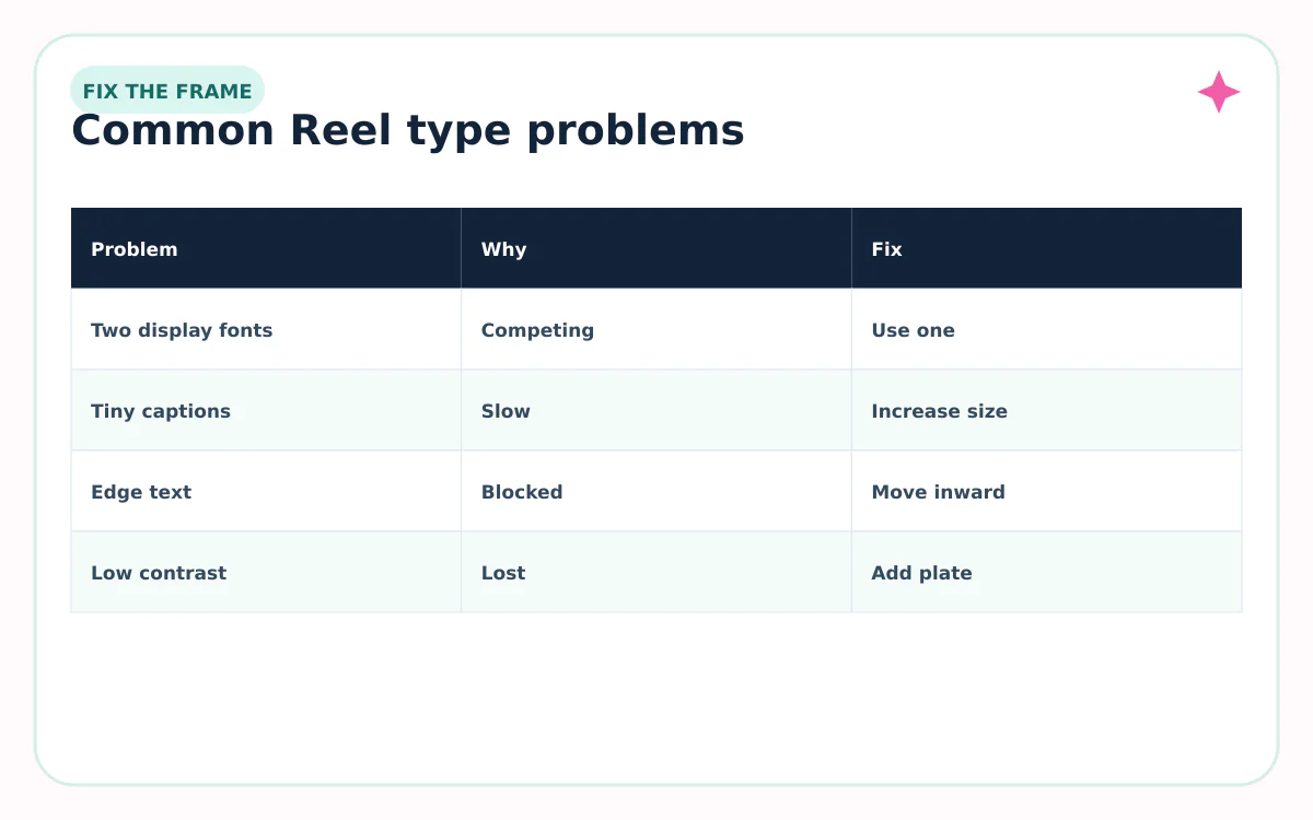
When a pairing fails, simplify in this order: shorten the copy, increase size, strengthen contrast, remove an effect, and only then replace the font. Most readability problems are hierarchy problems, not typeface problems.
Sources reviewed
Platform features and character rules can change. We checked the first-party and standards sources below on August 31, 2026.
Frequently asked questions
How many fonts should an Instagram Reel use?
Two is a useful maximum for most Reels: one display face for hooks and one readable face for captions, details, and calls to action.
What is the most readable font style for Reel captions?
A clean sans serif with open letterforms, adequate weight, and strong contrast is usually the safest choice. Size, timing, background, and placement matter as much as the family.
Do these fonts appear inside Instagram?
Availability varies by Instagram surface and rollout. The pairings are most useful in design and video editors; inside Instagram, choose available fonts that perform the same roles.
Where should text go on a Reel?
Keep essential text away from the top, bottom, and right-side controls. Meta’s ad safe-zone guidance is a conservative starting point, but always preview the actual organic Reel interface.
Should Reel captions use a script font?
Usually no. A script face can work for one short, large accent, but captions need fast recognition across multiple words and changing backgrounds.